NEER

One thought.
A recognisable world.

We give the brand’s central idea a visual form, then build the system that carries it across screens, surfaces and physical encounters. Each expression belongs to the same source.

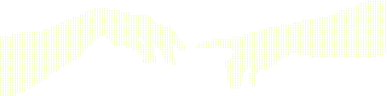
Coordinated geometric specimens in paper, metal and glass form a shared visual grammar.

Identity begins at the centre.

A mark is often the first thing people recognise. The identity around it gives that recognition depth: the character of the typography, the relationship between colours, the treatment of imagery and the way information occupies space. These decisions work together to make the brand present before a word is read.

We begin with the thought the business needs to carry. That thought directs the identity concept and logomark, then extends into a visual language with clear foundations. The system gives designers room to respond to different formats while retaining the qualities that make the brand its own.

Digital interfaces, printed material and physical applications place different demands on an identity. We consider those touchpoints as part of one connected expression. A brand book records the principles and applications, giving the people shaping the brand a reference for using it now and extending it as the business evolves.

From the central mark to the wider system.

Four connected capabilities give the brand a recognisable form and a considered way to carry it forward.

Give the central thought its mark.

Translate the brand’s central idea into a recognisable identity, logo and defining marks.

Establish the visual grammar.

Establish typography, colour, imagery, composition and graphic behaviour, supported by reusable design tokens and components.

Carry the identity across the whole encounter.

Define how the identity extends across digital and physical touchpoints, retaining coherence wherever people encounter the brand.

Document the principles that hold it together.

Document the identity’s principles, applications and usage rules, guiding how the system operates and evolves.

The NEER advantage

Frame-level visual discipline.

Frame-level visual discipline.

Editing, colour and VFX trained our attention on proportion, contrast and visual continuity. We bring that eye into identity, where the smallest relationship between forms can change the character of the whole.

Isometric illustration: Design with engineering depth

Design with engineering depth.

We understand how an identity behaves inside a working interface. Our development experience informs the tokens, components and visual rules that carry the brand into digital products.

Isometric illustration: An eye across materials and mediums

An eye across materials and mediums.

Our work spans film, print, packaging and digital experiences. That breadth helps us judge how an identity will hold its character as it moves between a screen, a physical surface and a moving frame.

Real Work. Connected Outcomes.

Selected work connecting brand identity, digital experience, and the systems behind the business.

Z Care Wellness
Kallisto Miorah

One Identity, Across The Range.

NEER developed Z Care Wellness’s brand identity, product packaging and website. A shared visual system connects bottles, drops, tubes and cartons while keeping each product distinct.

The online shop carries that identity through catalogue browsing and product pages, making the range easier to explore.

Power, Given Form.

NEER developed Kallisto Miorah’s positioning, brand character and visual identity around a composed approach to power dressing. A phoenix symbol and a precise wordmark express the idea of enduring presence.

The identity carries through to garment labels, cards, shopping bags and the unboxing experience.

One Identity, Across The Range.

NEER developed Z Care Wellness’s brand identity, product packaging and website. A shared visual system connects bottles, drops, tubes and cartons while keeping each product distinct.

The online shop carries that identity through catalogue browsing and product pages, making the range easier to explore.

Power, Given Form.

NEER developed Kallisto Miorah’s positioning, brand character and visual identity around a composed approach to power dressing. A phoenix symbol and a precise wordmark express the idea of enduring presence.

The identity carries through to garment labels, cards, shopping bags and the unboxing experience.

Real Commercial Proof.

Direct feedback from business founders and managing directors on brand perception, margin defense, and market authority.

quote
Pradip Morya
Founder
quote
Dr. Harsh Morya
CEO

Before we begin

Yes. We first assess how it fits the direction of the brand. The work may focus on strengthening the wider system, refining the mark or creating a new identity where needed.

The scope can cover the identity concept, logo, visual system, touchpoint strategy and brand book. We agree on the depth and applications your business needs before beginning.

We define the required assets, formats and guidelines in the proposal. That gives your team and suppliers a clear understanding of what they will receive and how to use it.

Yes. We plan the system around the touchpoints in your scope. Detailed design and production of each application are specified separately where required.

The concept begins with your brand's central thought, context and character. We use that direction to judge the visual choices, with the competitive landscape providing an important reference.

The visual rules and brand book give future work a foundation. New applications can extend the identity around those principles, with further design work scoped as needed.