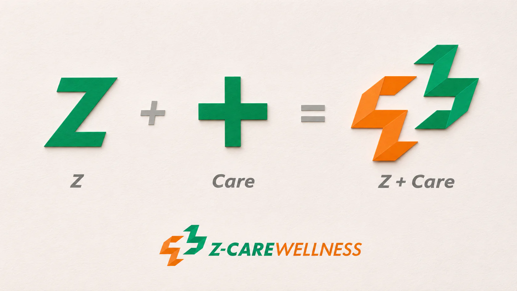
Brand name and logo concept. The Z in Z Care expresses a distinct direction within a healthcare landscape often viewed through established categories such as allopathy and homeopathy. The X, Y and Z axes informed the name. A third direction became a metaphor for the brand’s individual identity and homeopathic focus.
The icon combines a Z and a plus sign in one geometric mark. The Z links to the name. The plus uses a familiar healthcare symbol to express care, protection and safety as brand values. Green and orange convey reassurance, warmth and vitality. The identity carries a clear healthcare connection and a distinctive visual character.
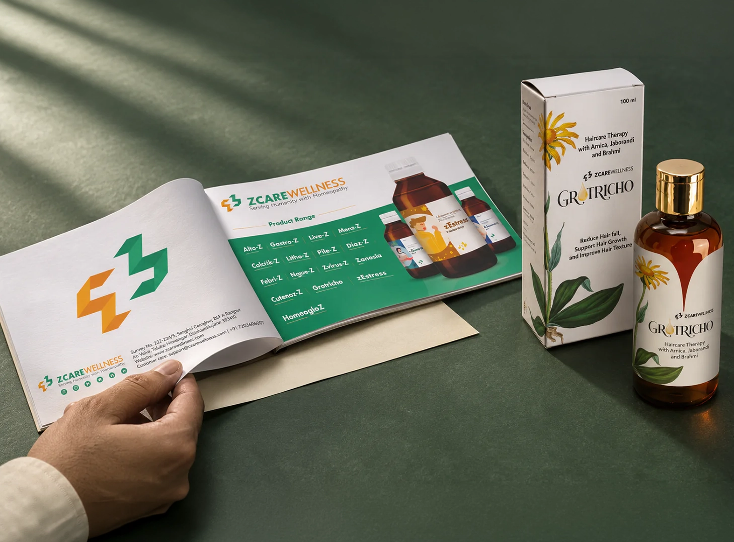
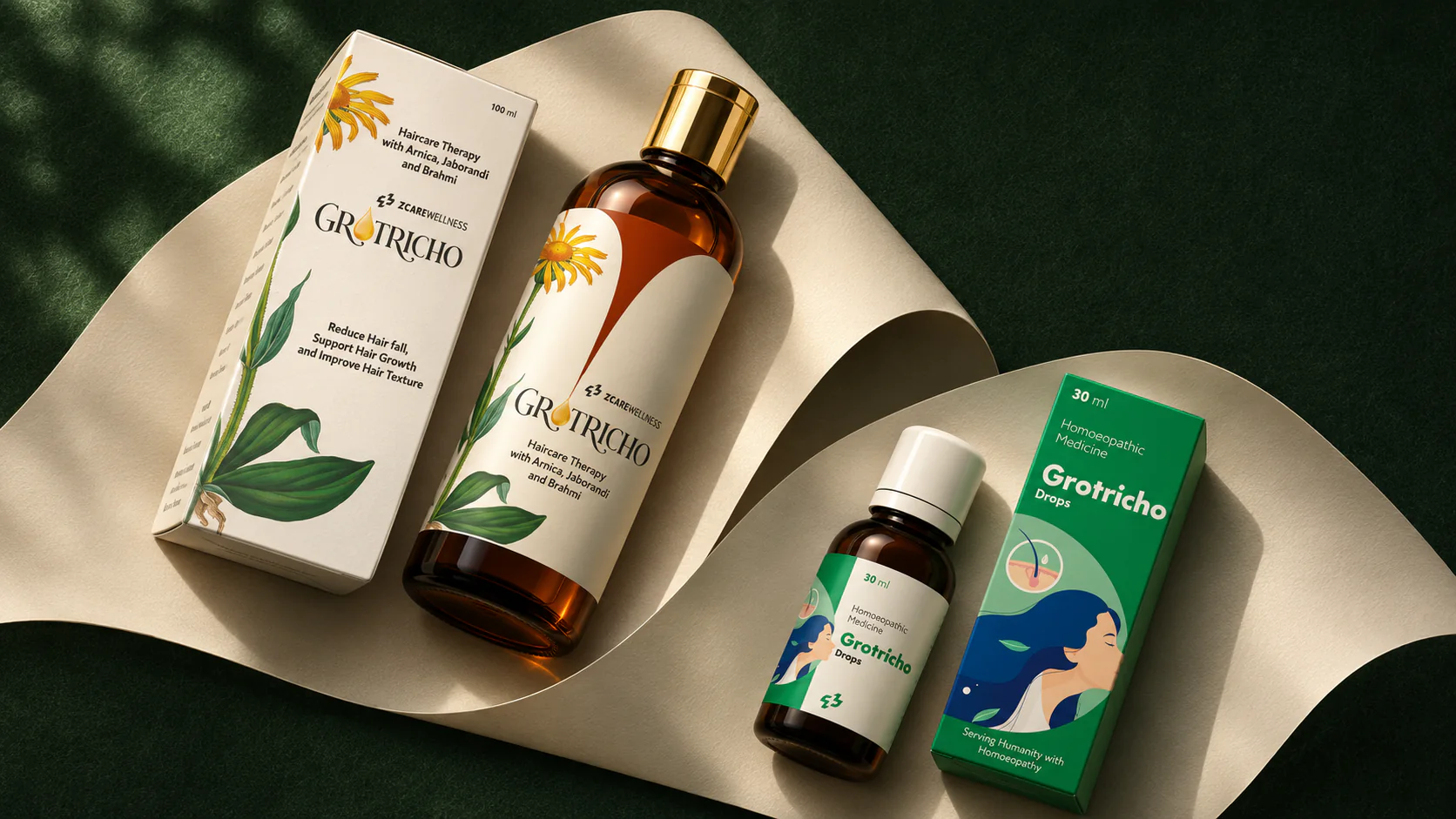
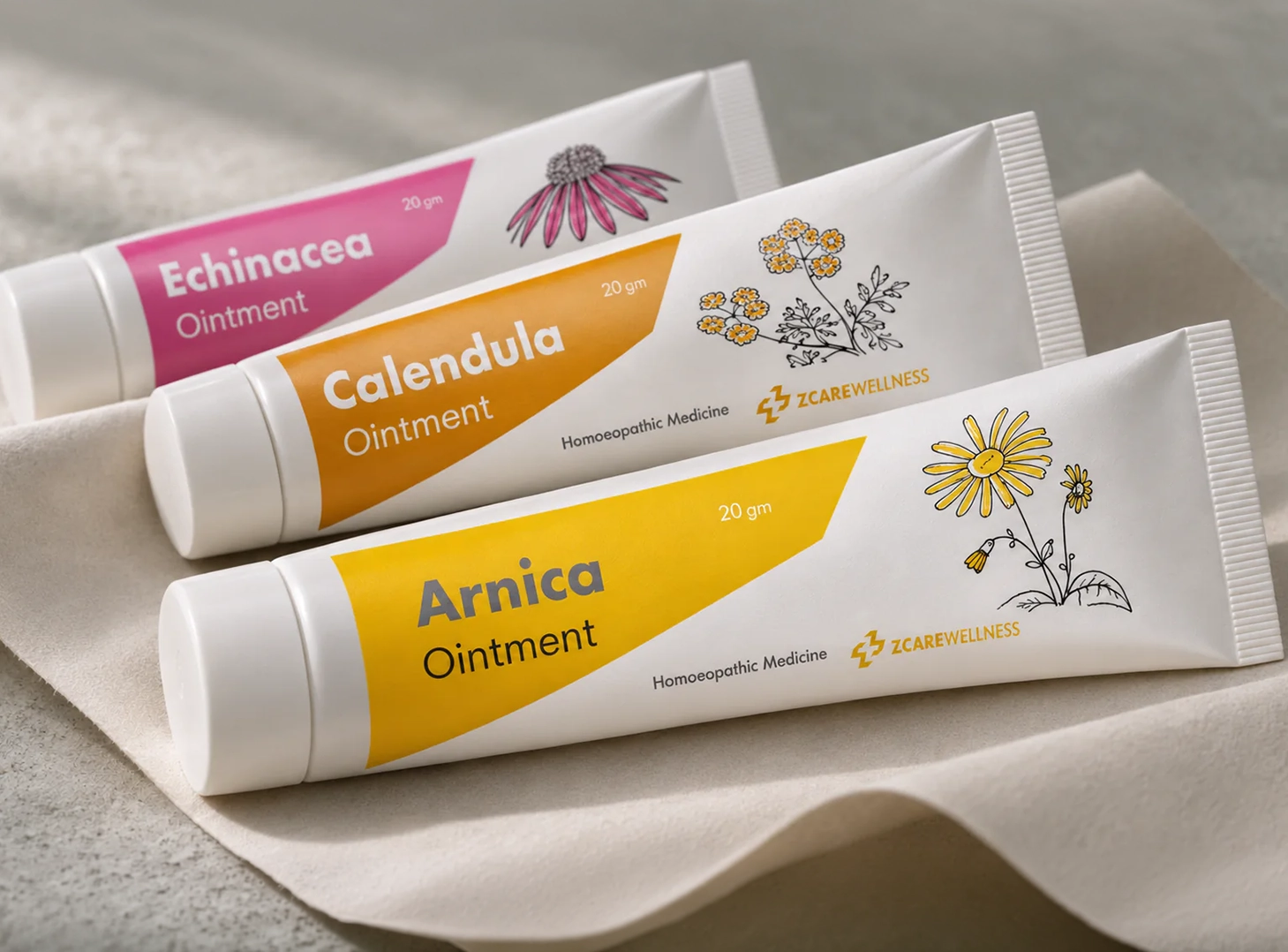
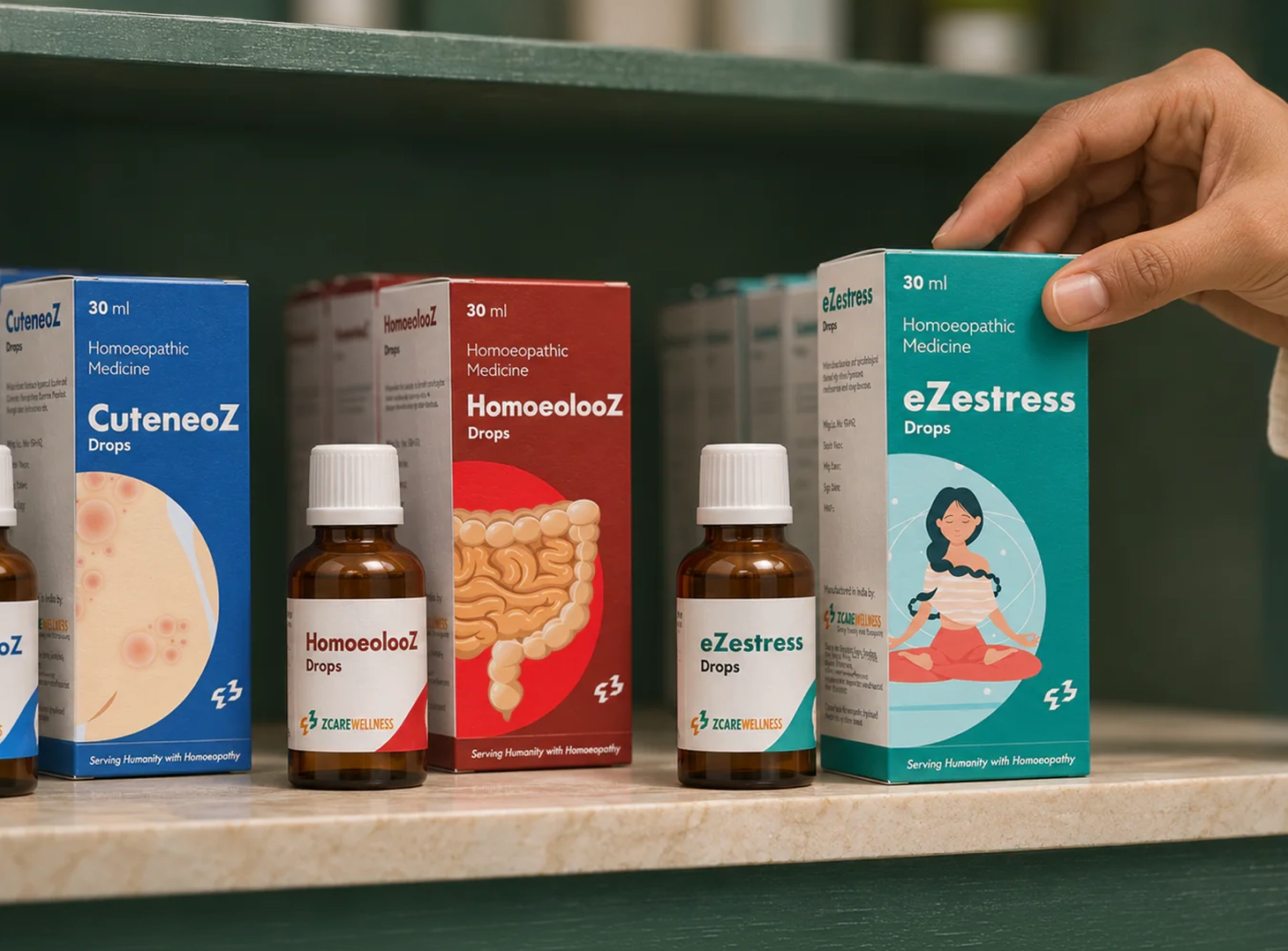
Product packaging. We adapted the identity to the range’s bottles, drops, tubes and cartons. The layouts organise product names, formats and information while keeping each product distinct.
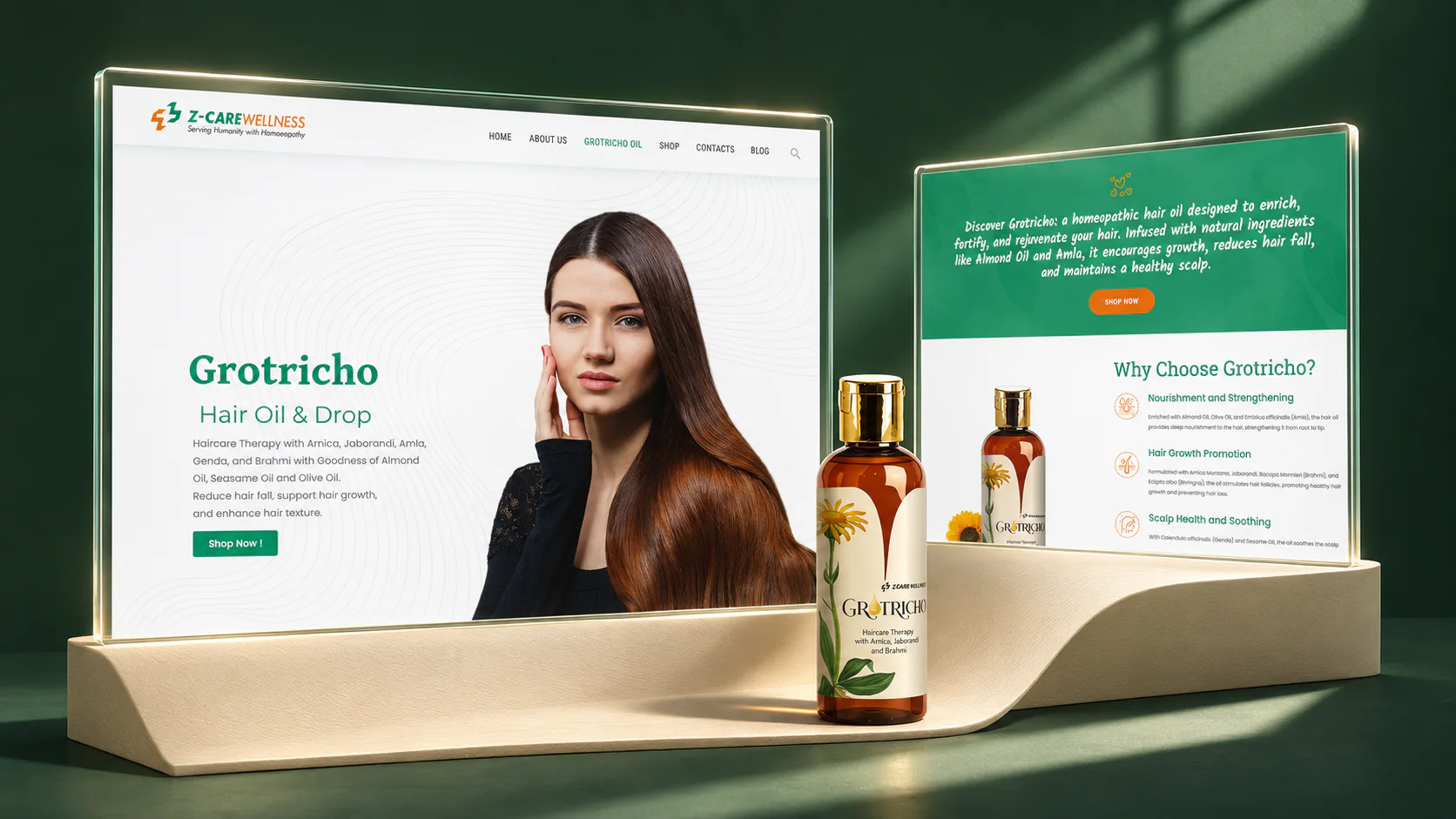
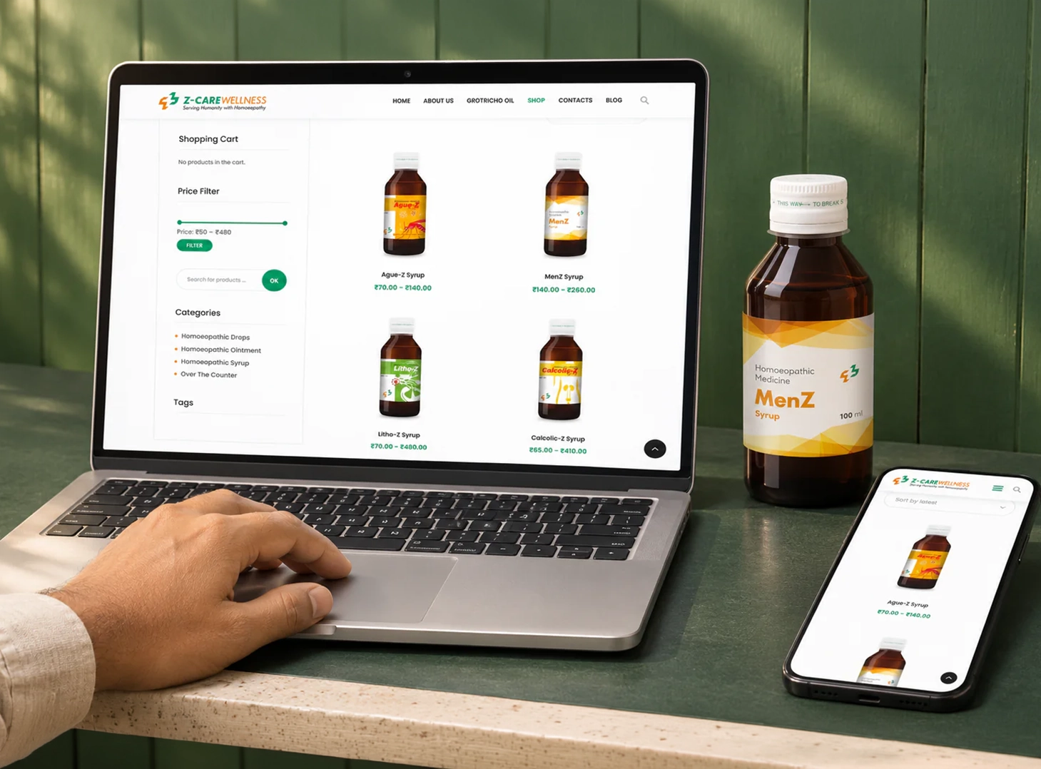
Website and ecommerce. We designed and developed the website around the brand and its catalogue. The shop, product pages and Grotricho landing page connect packaging presentation with product discovery and the next step online.