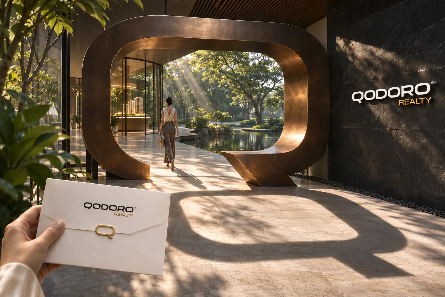
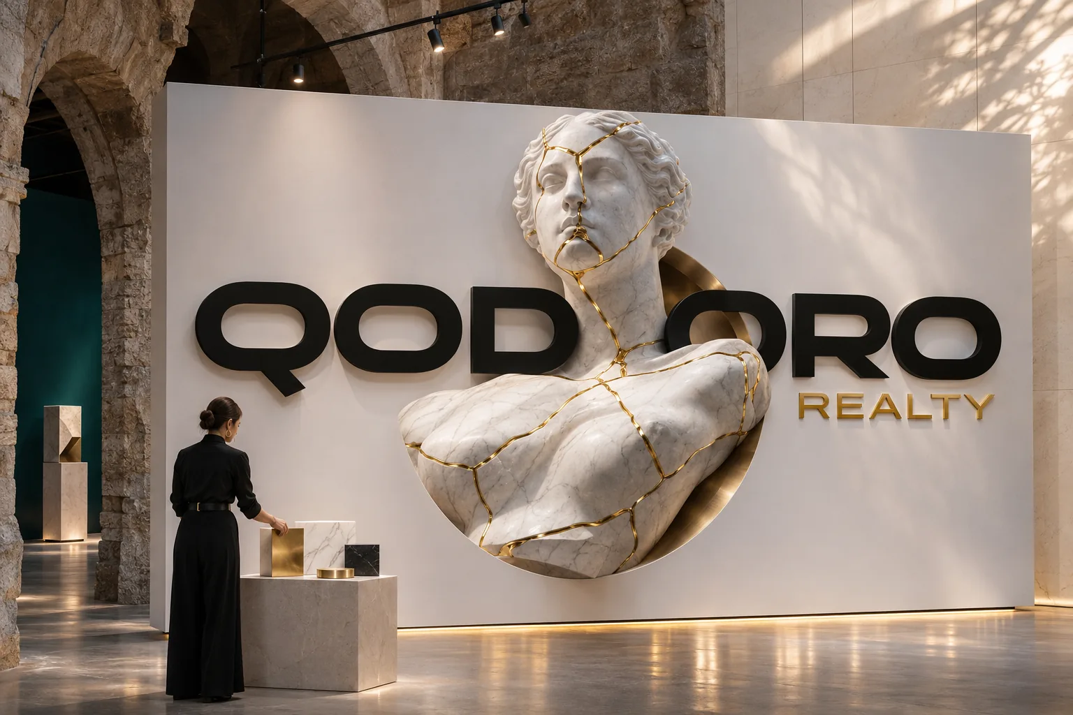
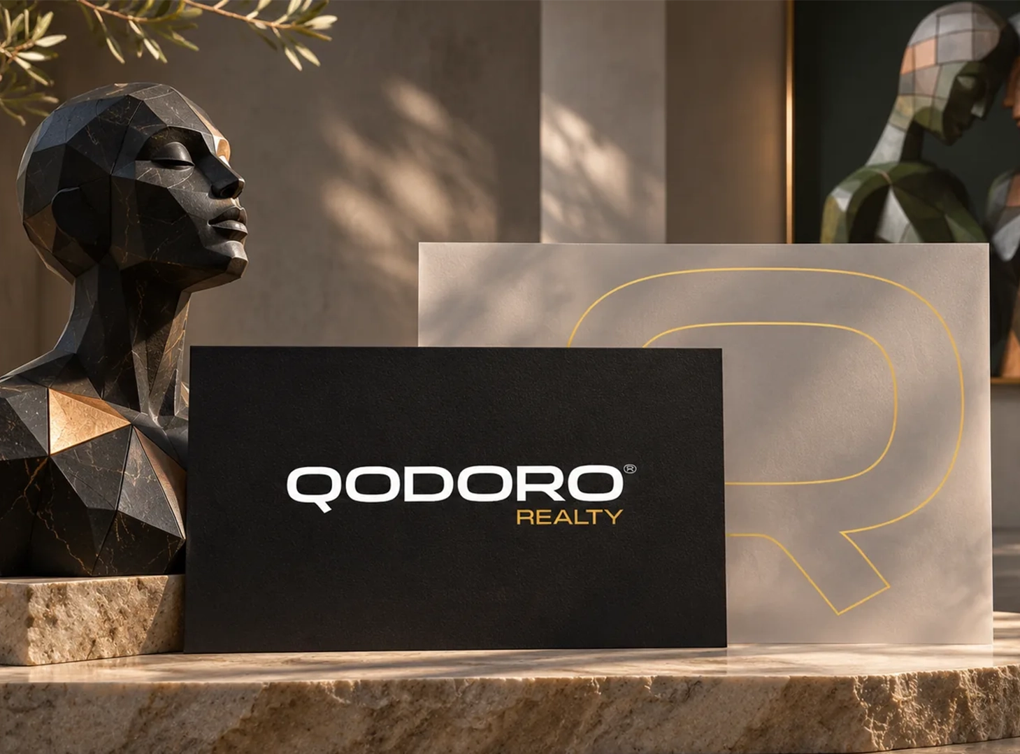
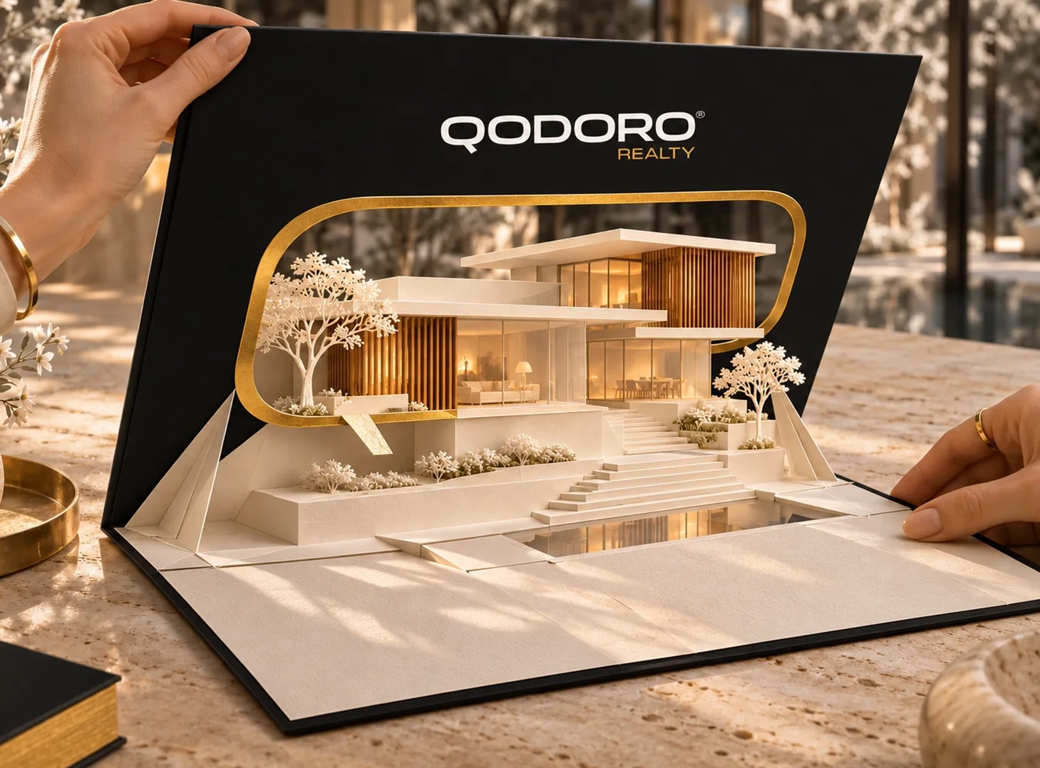
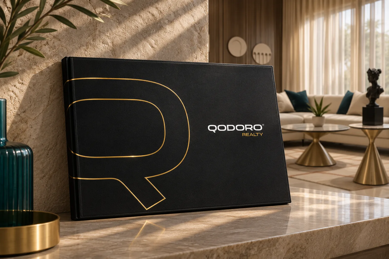
Qodoro Realty needed a visual identity that reflects its considered approach to real estate. NEER built a wordmark, palette and brand visuals that give its communications a clear, consistent presence.
Challenges
The challenge was to create a distinctive identity for a real estate brand without relying on familiar property symbols. It needed to feel composed as a wordmark and remain clear across launch communications and visual materials.
Solutions
We built the identity around a geometric wordmark, a considered palette, bold typography and a distinctive Q motif. The system carries the brand across identity materials and launch creatives.
Impact
The result is a connected identity with a recognisable name and a consistent visual presence. The wordmark, colour palette and graphic elements work together across the brand materials shown here.